c-Office
finished year 2004
location Aichi, Japan
principal use Office
total floor area 1242.97m2
structure Timber
freshly made space
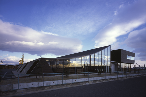
This was open competition in the end of 2002, to design a new branch office in Nagoya for a Japanese wood-processing company. The competition brief required the office to be a 2 storey-high timber structure, have a total floor area of 1,200m2 and challenge the new possibilities of timber structure or construction methods using douglas pine dried wood or laminated lumber, which are the products of this company. Our proposal was selected as the winner of this competition, and from this moment, this rollercoaster project started, which we had to complete the building in 1 year from the competition with 3 months for design and 6 months for construction.
In the competition brief, we focused on 3 points.
・The products of this company are high quality as an industrial material in terms of the accuracy of the douglas pine dried wood and the intensity of the laminated lumber.
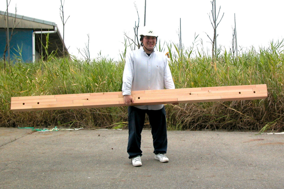
・Because the products are intended for building houses, the dimension of each members are small compared to the total floor area of 1200m2, which is relatively big for timber.
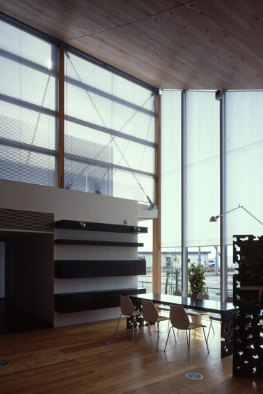
・Not only the building would be used as an office, but also as a showroom where the company’s products are actually used and shows the possibilities of timber-buildings.
This competition was a great chance for us, since we were always thinking of using timber in a completely new way where we wanted to remove the stereotypes of timber such as “friendly” or “traditional and rooted in the community”.
Using these points as clues, we were able to find the main direction of this project, such as the framework method of creatively using the small dimension and the weakness of wood and utilizing the building as a whole to make the whole space as a showroom for wood and not dividing each of the functions.
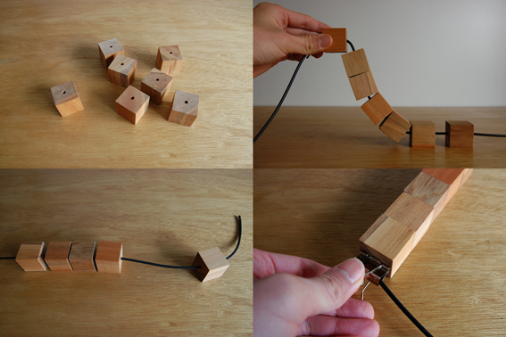
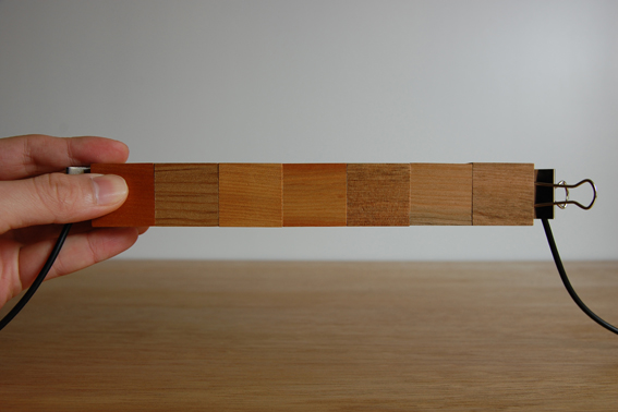
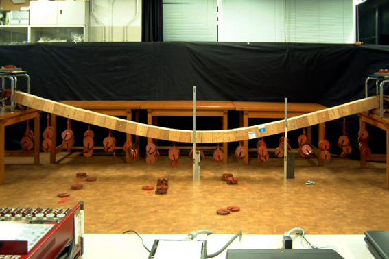
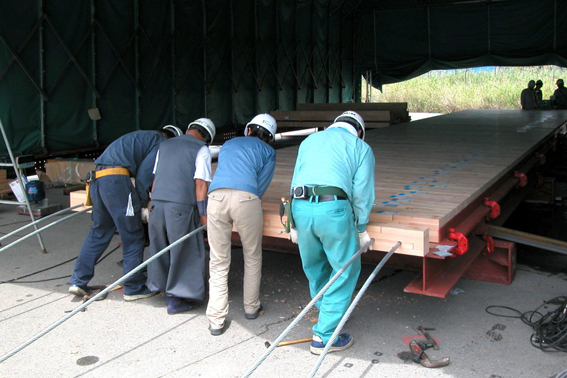
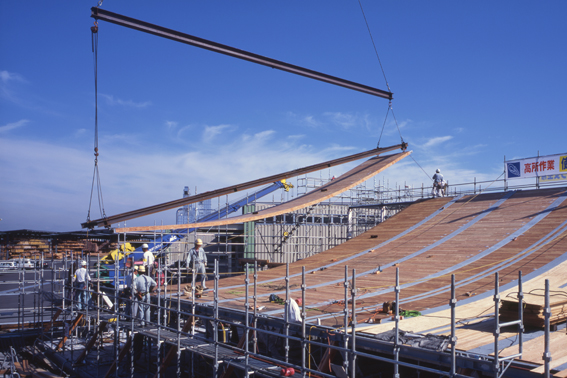
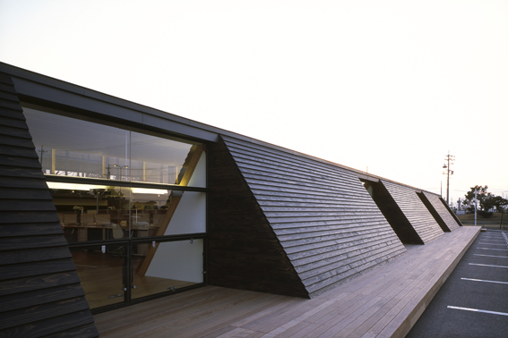
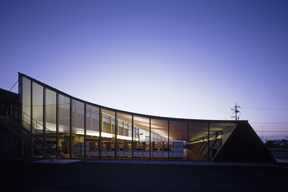
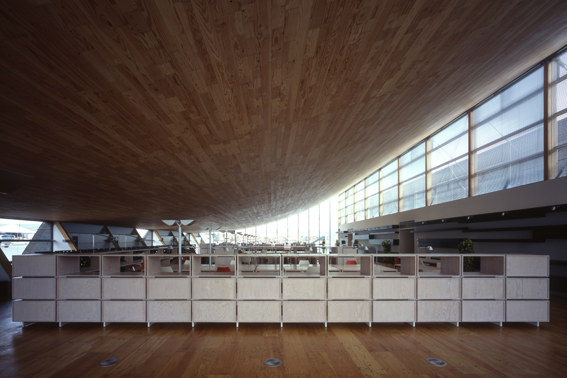
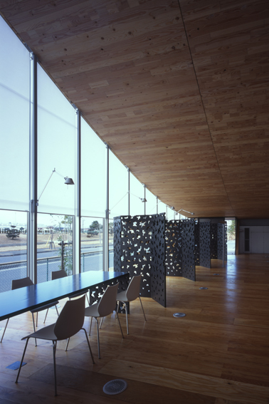
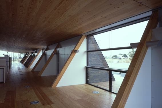
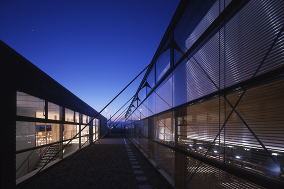
In particular, we created 3 different size spaces, large (500m2), medium (200m2) and small (70m2) with single house dimension timber by 3 simple methods that are hang, interlock and stack. The shape of the hanging roof is the natural result of the relation of the load and the intensity of the timber. The smooth curved surface is possible with the square section linear wood, since wood is soft and weak.
Since the structural concept has no precedents and the design and construction period was short, we were anticipating this architecture to have certain newness and a sense of speeds that it was immediately built after designed. However, we didn’t want it to merely be new or have momentum. The architects ourselves need a new value of architecture in order to design towards architecture that is confortable and appealing when you actually visit. For this project, we had an image like “freshness”, which is usually associated in cooking. If we could make this newness and speed, the quality of the space of this building, like cooking where they highly evaluate the freshness of the ingredients and “freshly made” meals, we wouldn’t enter the blind alleys of competing the eccentricity of the ideas but could create a fresh and unique space with having a good relation with experience and tectonics.
